Chip
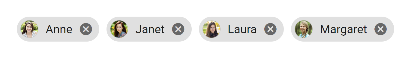
A basic Chip component that should render nicely on any platform. Supports a good level of customization.
You can customization Chip component with the Props
Usage#
Reference#
Props#
here all the list of Props you can use for Avatar Component and it Inherits all ViewProps Props, from React Native
source#
source props for give the image url to the Avatar by default it show some ramdom image url type string before loading the image it will show you gray background color
ImageSize#
this props gives you 3 different imagesize like 'large' | 'small' | 'medium' type string default value is medium
mode#
this props gives you two types of mode 'flat' | 'outlined' type string
avatar#
if you give the source props,it must be avatar will be true otherwise it will not show the image in chips component
customSize#
if you give the customsize props type number it will increase the image Size.ex:customSize={20}
fontSize#
if you give the fontSize props type number it will increase the text size and default value is 13
textColor#
if you give the textColor props type string it will chage the text color and default color is black
borderRadius#
if you give the borderRadius props type number it will change the borderRadius of Image only and default value is 25
ViewBgColor#
if you give the ViewBgcolor props string it will change the Backgroundcolor of chip component and default color is black
ViewBorderRadius#
if you give the ViewBorderRadius props type number it will change the borderRadius of chip component and default value is 10
onclose#
if you give the onclose props type function it will show the close button in chip component
onpress#
if you give the onpress props type function it will show the selected value and it must be source and avatar