Overlay

img

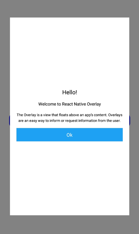
A basic Overlay component that should render nicely on any platform. Supports a good level of customization.

You can customization Overlay component with the Props

Usage#

import React, {FC, useState} from 'react';
import {Body,Overlay} from 'qdmrncomponents';
const App: FC = () => {
const [toggle,setToggle] = useState(false);
const toggleModal = (val : boolean) =>{
setToggle(val)
}
const button1Func = () =>{
console.log('button 1 pressed')
}
return (
<Body paddingAll={20} V_Aligin_center>
<Overlay
isVisible={toggle}
title="Hello!"
subTitle="Welcome to React Native Overlay"
description="The Overlay is a view that floats above an app’s content. Overlays are an easy way to inform or request information from the user."
button1={true}
button1Text="Ok"
button1Onpress={button1Func}
/>
<Button label="Open Overlay Modal" onPress={()=>toggleModal(true)} />
</Body>
);
};

Reference#

Props#

isVisible#

isVisible props props for show or hide overlay modal and its type boolean

backButtonPress#

backButtonPress props is called when the Android back button is pressed and its type Fucntion

import React, {FC, useState} from 'react';
import {Body,Overlay} from 'qdmrncomponents';
const App: FC = () => {
const [toggle,setToggle] = useState(false);
const toggleModal = (val : boolean) =>{
setToggle(val)
}
const button1Func = () =>{
console.log('button 1 pressed')
}
const cancelModal = () =>{
toggleModal(false);
}
return (
<Body paddingAll={20} V_Aligin_center>
<Overlay
isVisible={toggle}
title="Hello!"
subTitle="Welcome to React Native Overlay"
description="The Overlay is a view that floats above an app’s content. Overlays are an easy way to inform or request information from the user."
button1={true}
button1Text="Ok"
button1Onpress={button1Func}
backButtonPress={cancelModal}
/>
<Button label="Open Overlay Modal" onPress={()=>toggleModal(true)} />
</Body>
);
};

backdropPress#

backdropPress props is called when outside of the modal is pressed and its type Function

import React, {FC, useState} from 'react';
import {Body,Overlay} from 'qdmrncomponents';
const App: FC = () => {
const [toggle,setToggle] = useState(false);
const toggleModal = (val : boolean) =>{
setToggle(val)
}
const button1Func = () =>{
console.log('button 1 pressed')
}
const cancelModal = () =>{
toggleModal(false);
}
return (
<Body paddingAll={20} V_Aligin_center>
<Overlay
isVisible={toggle}
title="Hello!"
subTitle="Welcome to React Native Overlay"
description="The Overlay is a view that floats above an app’s content. Overlays are an easy way to inform or request information from the user."
button1={true}
button1Text="Ok"
button1Onpress={button1Func}
backdropPress={cancelModal}
/>
<Button label="Open Overlay Modal" onPress={()=>toggleModal(true)} />
</Body>
);
};

modalWidth#

modalWidth props for changing width of the modal and type number between (0 to 100)

import React, {FC, useState} from 'react';
import {Body,Overlay} from 'qdmrncomponents';
const App: FC = () => {
const [toggle,setToggle] = useState(false);
const toggleModal = (val : boolean) =>{
setToggle(val)
}
const button1Func = () =>{
console.log('button 1 pressed')
}
const cancelModal = () =>{
toggleModal(false);
}
return (
<Body paddingAll={20} V_Aligin_center>
<Overlay
isVisible={toggle}
modalWidth={100}
title="Hello!"
subTitle="Welcome to React Native Overlay"
description="The Overlay is a view that floats above an app’s content. Overlays are an easy way to inform or request information from the user."
button1={true}
button1Text="Ok"
button1Onpress={button1Func}
backdropPress={cancelModal}
/>
<Button label="Open Overlay Modal" onPress={()=>toggleModal(true)} />
</Body>
);
};

modalHeight#

modalHeight props for changing height of the modal and type number between (0 to 100)

modalPadding#

modalPadding props for providing padding to overlay modal and type number

title#

props for changing title text and type string

subTitle#

props for changing subTitle text and type string

description#

props for changing description text and type string

button1#

set to true button1 shows default false and type boolean

button1Text#

props for the button1 text and type string

button1Onpress#

props for onpress function for button1 and type Function

button2#

set to true button2 shows default false and type boolean

button2Text#

props for the button2 text and type string

button2Onpress#

props for onpress function for button2 and type Function

titleFontSize#

props for changing font size of the title and type number

titleFontColor#

props for changing font color of the title and type string

titleFontWeight#

props for changing font weight of the title and type string-'bold'

subTitleFontSize#

props for changing font size of the subTitle and type number

subTitleFontColor#

props for changing font color of the subTitle and type string

subTitleFontWeight#

props for changing font weight of the subTitle and type string-'bold'

descriptionFontSize#

props for changing font size of the description and type number

descriptionFontColor#

props for changing font color of the description and type string

descriptionFontWeight#

props for changing font weight of the description and type string-'bold'

button1FontSize#

props for changing font size of the button1 and type number

button1FontColor#

props for changing font color of the button1 and type string

button1FontWeight#

props for changing font weight of the button1 and type string-'bold'

button2FontSize#

props for changing font size of the button2 and type number

button2FontColor#

props for changing font color of the button2 and type string

button2FontWeight#

props for changing font weight of the button2 and type string-'bold'