PopOver
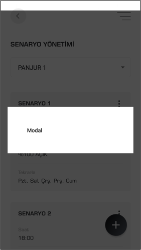
A basic PopOver component that should render nicely on any platform. Supports a good level of customization.
You can customization Image component with the Props
Usage#
Basics#
Reference#
Props#
here all the list of Props you can use for StarRating Component and it Inherits all ViewProps, from React Native
position#
this props gives you different position like | 'TopLeft'| 'TopMiddle'| 'TopRight'| 'MiddleLeft'| 'MiddleMiddle'| 'MiddleRight'| 'BottomLeft'| 'BottomMiddle'| 'BottomRight'; type string and default value is MiddleMiddle
width#
props gives you width of button type number default value is 100
modelVisible#
props type is boolean. If give the value true it show the model
onBackdropPress#
prop type is function . If you want to click the OuterView of contentView , function will be called ex:onBackdropPress={()=>{modelvisbile(false)}}
onpress#
prop type is function . If you click the button onpress function will be called ex:onpress={()=>{modelvisbile(true)}}
buttonColor#
props gives you buttonColor type string default value is gray
buttonStyle#
props give addition props to the button element type Object
contentStyle#
props give addition props to the content element type Object
content#
props render the jsx elements ..ex: content={
contentBgColor#
props gives you contentBgColor type string default value is white
contentWidth#
props gives you contentWidth type number default value is 250 number
paddingAll#
props for padding for all the four sides of the content by default it 10 number
paddingLR#
props for padding for all the left and right sides of the content by default it none number
paddingTB#
props for padding for all the top and bottom sides of the content by default it none number