Collapse
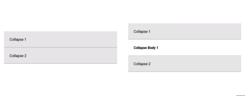
A basic Collapse component that should render nicely on any platform. Supports a good level of customization.
You can customization Collapse component with the Props
Usage#
Reference#
Props#
component#
component props of the Collapse used to list the collapsible data and its type Array of object>
headerBackgroundColor#
headerBackgroundColor props is used tochanging the background color of the header String
borderColor#
props for changing the border color and type string
headerFontSize#
props for changing the size of the collapse header and type number
headerFontColor#
props for changing the color of the collapse header font and type String
headerFontWeight#
props for changing font weight of the collapse header and type string-'bold'
inlineStyle#
props give addition props to the Button element type Object