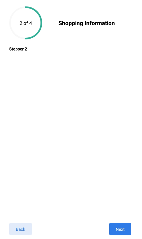
Stepper
A basic Stepper component that should render nicely on any platform. Supports a good level of customization.
You can customization Stepper component with the Props
Usage#
Reference#
component#
component props is used to provide stepper header and body the type Array of object
active#
active props is used to set the initial screen to render and its type number staring from 0.Default is 0.
circularBarSize#
circularBarSize props for the size of the circular progress bar and its type number
circleWidth#
circleWidth props for the circular progress bar thickness and its type number
circleActiveColor#
circleActiveColor props for the active progress bar circle and type string
circleInActiveColor#
circleInActiveColor props for the inactive progress bar circle and type string
stepperFontSize#
props for changing font size of the text inside the circular bar and type number
stepperFontColor#
props for changing font color of the text inside the circular bar and type string
stepperFontWeight#
props for changing font weight of the text inside the circular bar and type string-'bold'
nextButtonFontSize#
props for changing font size of the next button and type number
nextButtonFontColor#
props for changing font color of the next button and type string
nextButtonFontWeight#
props for changing font weight of the next button and type string-'bold'
backButtonFontSize#
props for changing font size of the back button and type number
backButtonFontColor#
props for changing font color of the back button and type string
backButtonFontWeight#
props for changing font weight of the back button and type string-'bold'
stepperHeaderFontSize#
props for changing font size of the stepperHeader and type number
stepperHeaderFontColor#
props for changing font color of the stepperHeader and type string
stepperHeaderFontWeight#
props for changing font weight of the stepperHeader and type string-'bold'
nextButtonBgColor#
props for changing background color of the next button and type string
backButtonBgColor#
props for changing background color of the back button and type string
buttonRadius#
props for changing border radius for next and back buttons and type number
